→ A new identity for a more neighborly real estate experience.
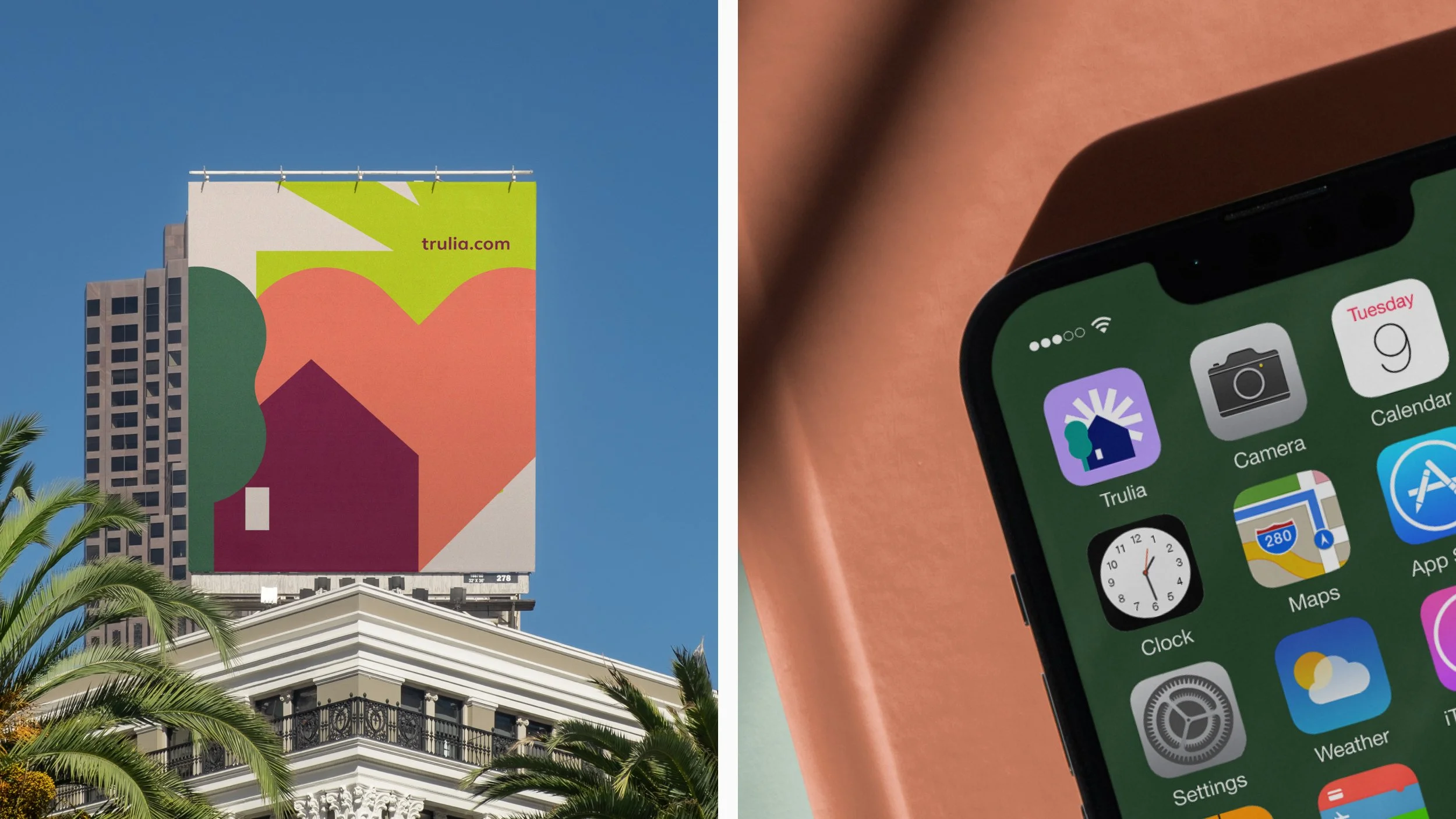
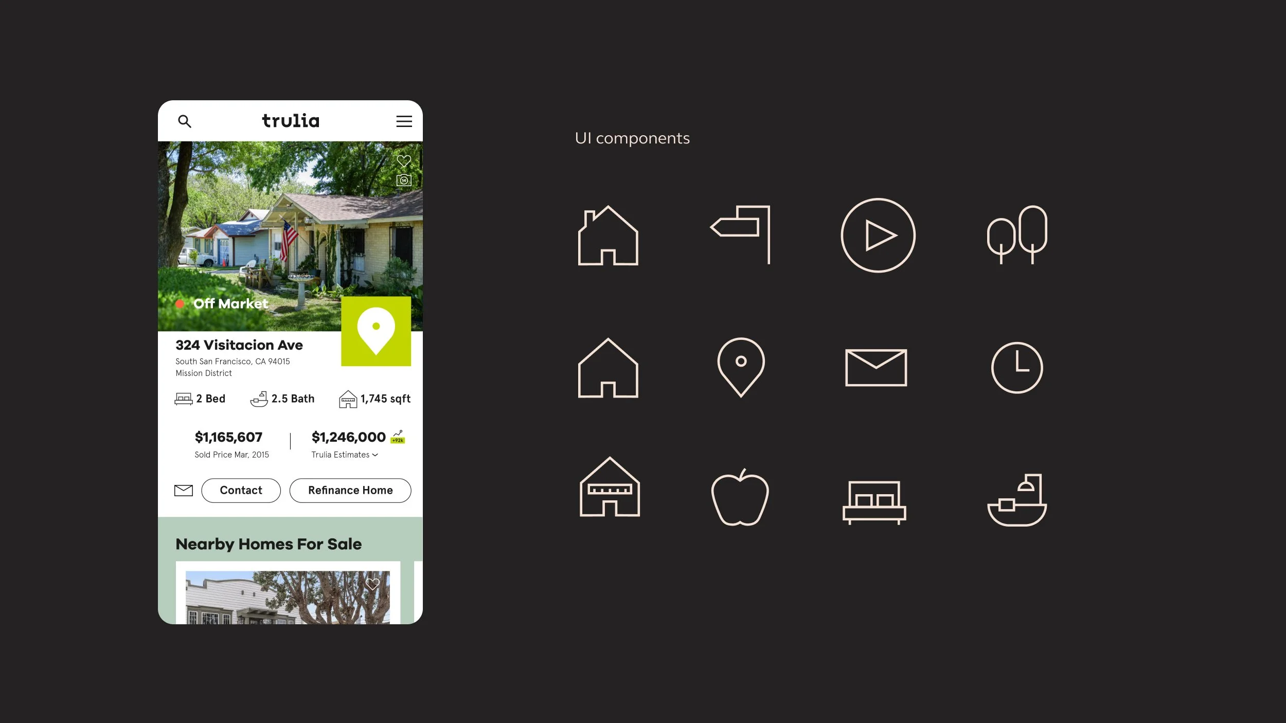
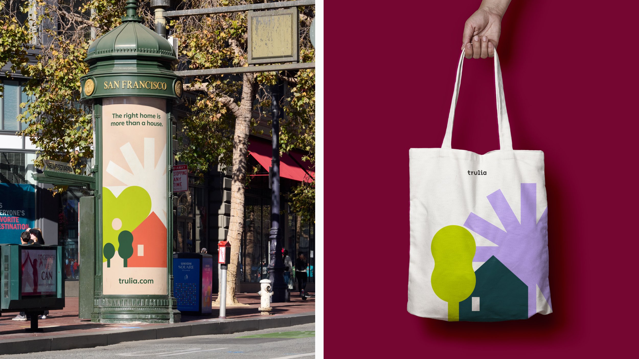
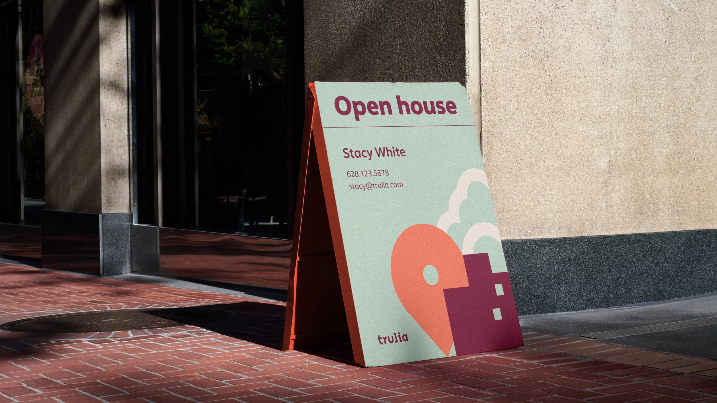
Trulia believes that when it comes to finding a home, what’s outside the front door is just as important as what’s behind it. By going beyond typical listing details, Trulia gives people a deeper understanding of what living in a home and neighborhood is really like. A vibrant new visual language inspired by map iconography and neighborhood geographies was created to represent their brand purpose — to build a more neighborly world. The identity represents the diversity of dwellings, environments, and amenities with a wide set of icons flexing easily between highly functional or expressive.
Trulia, 2019
Branding, Digital
Studio: DesignStudio (San Francisco)
Creative Directors: James Hurst
Design Director: André Coelho
Designers: Lisa Lindh, Duy Dao, Roberto Warner (motion)