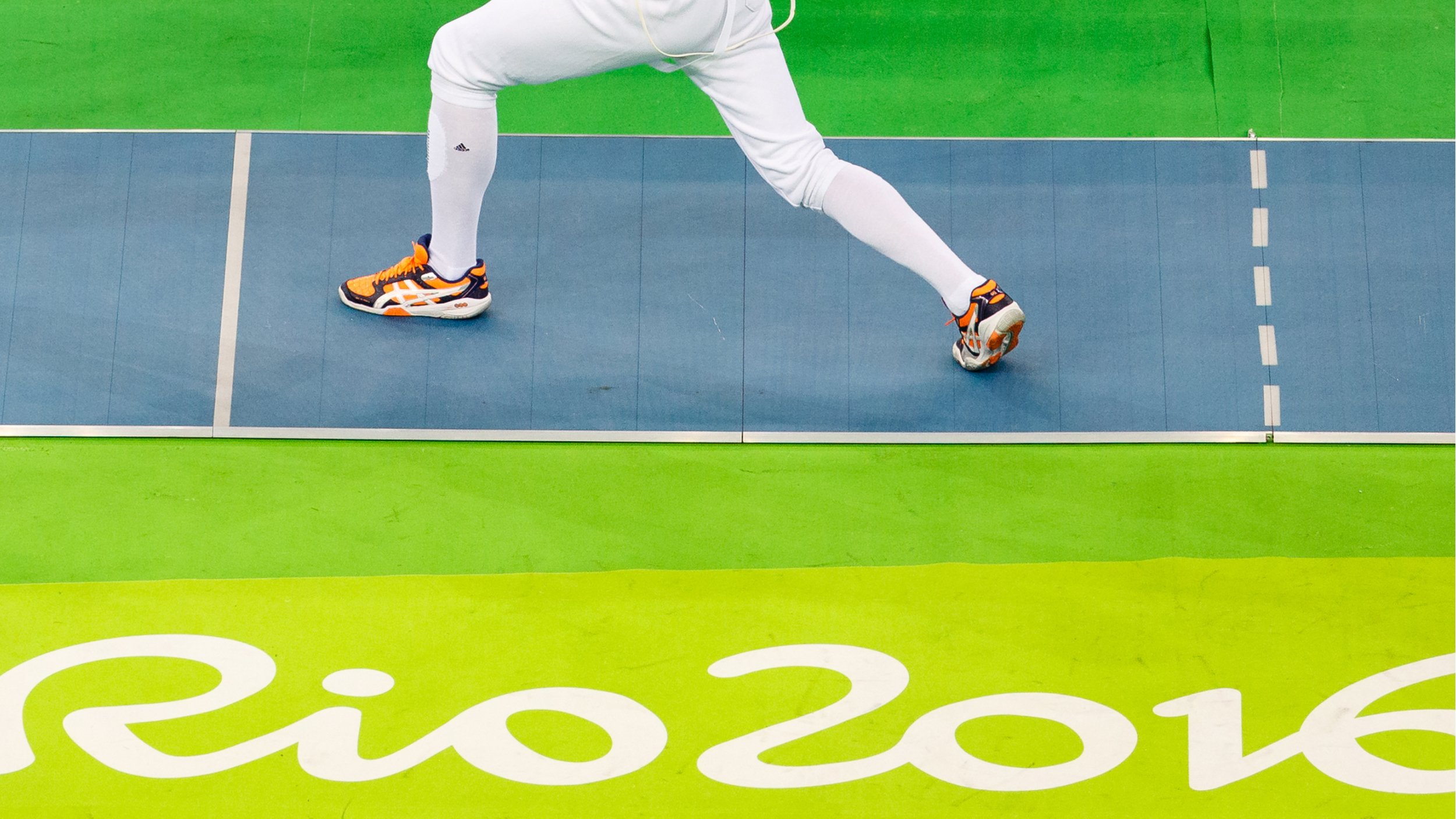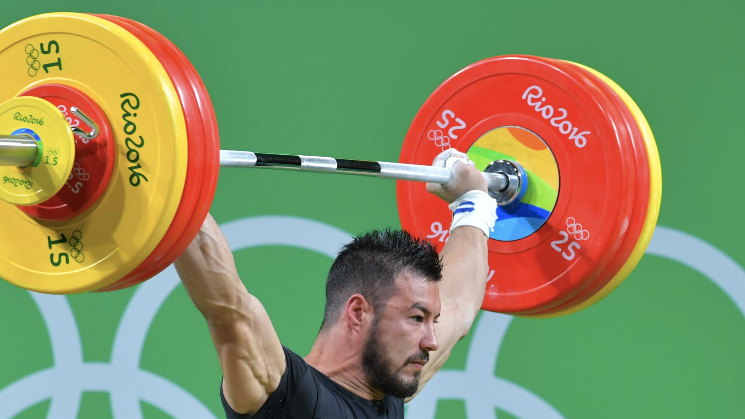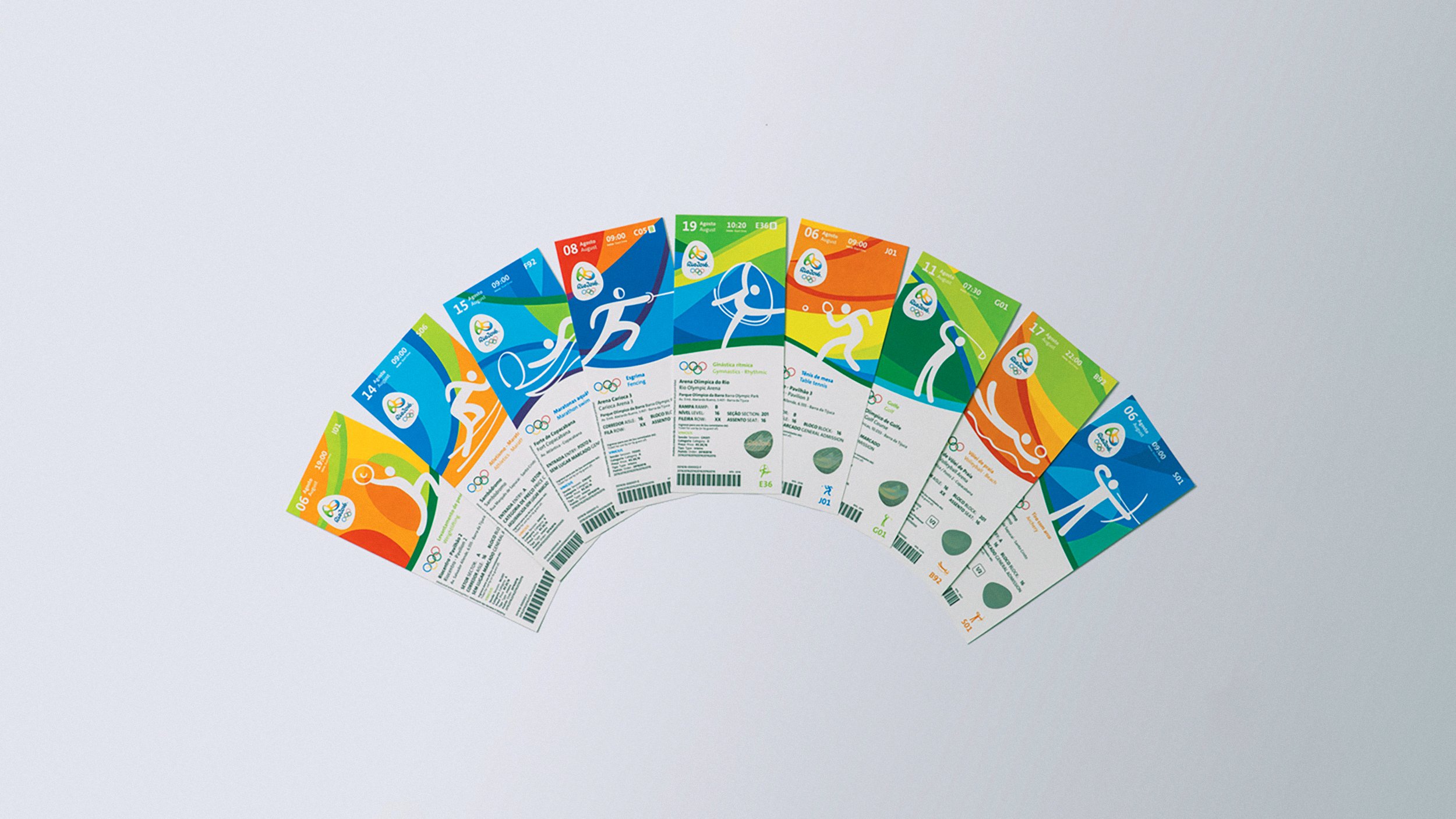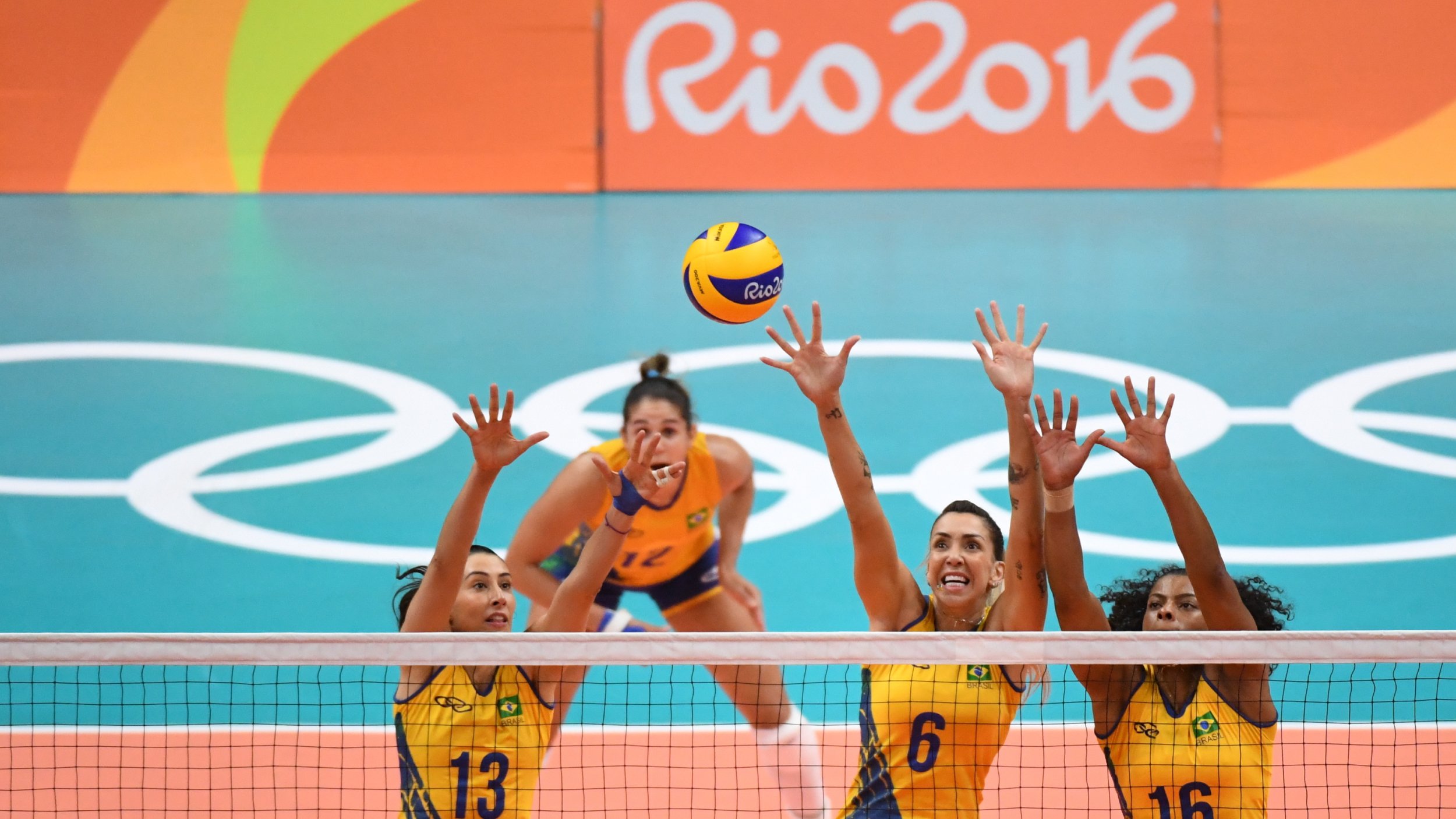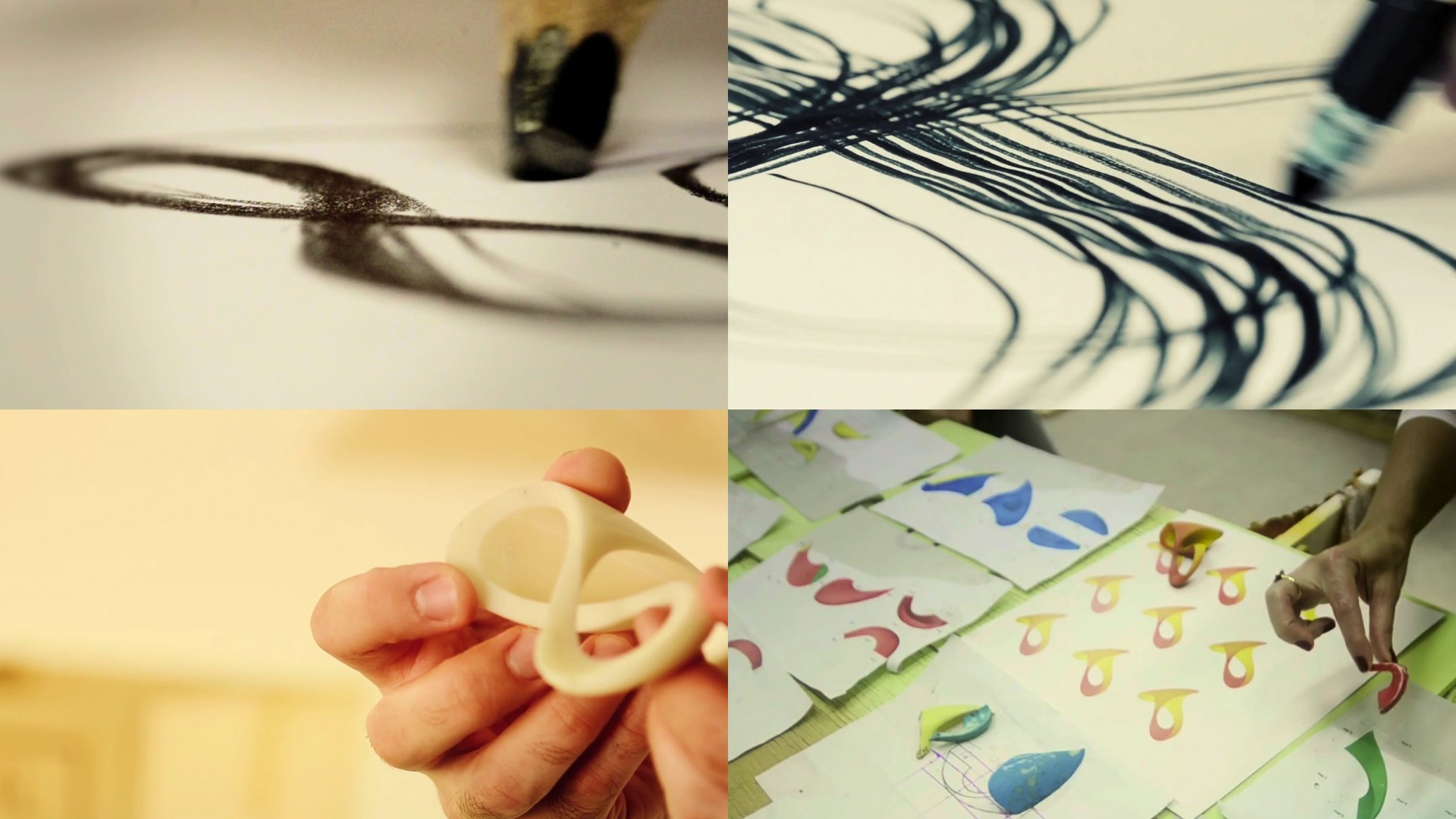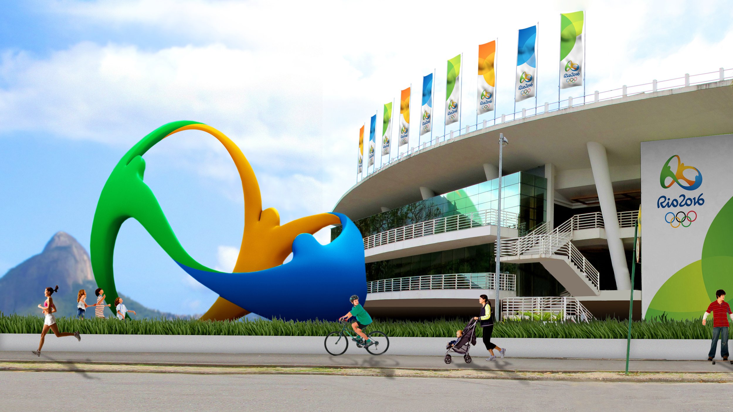
→ A sculptural identity for an Olympic city like no other.
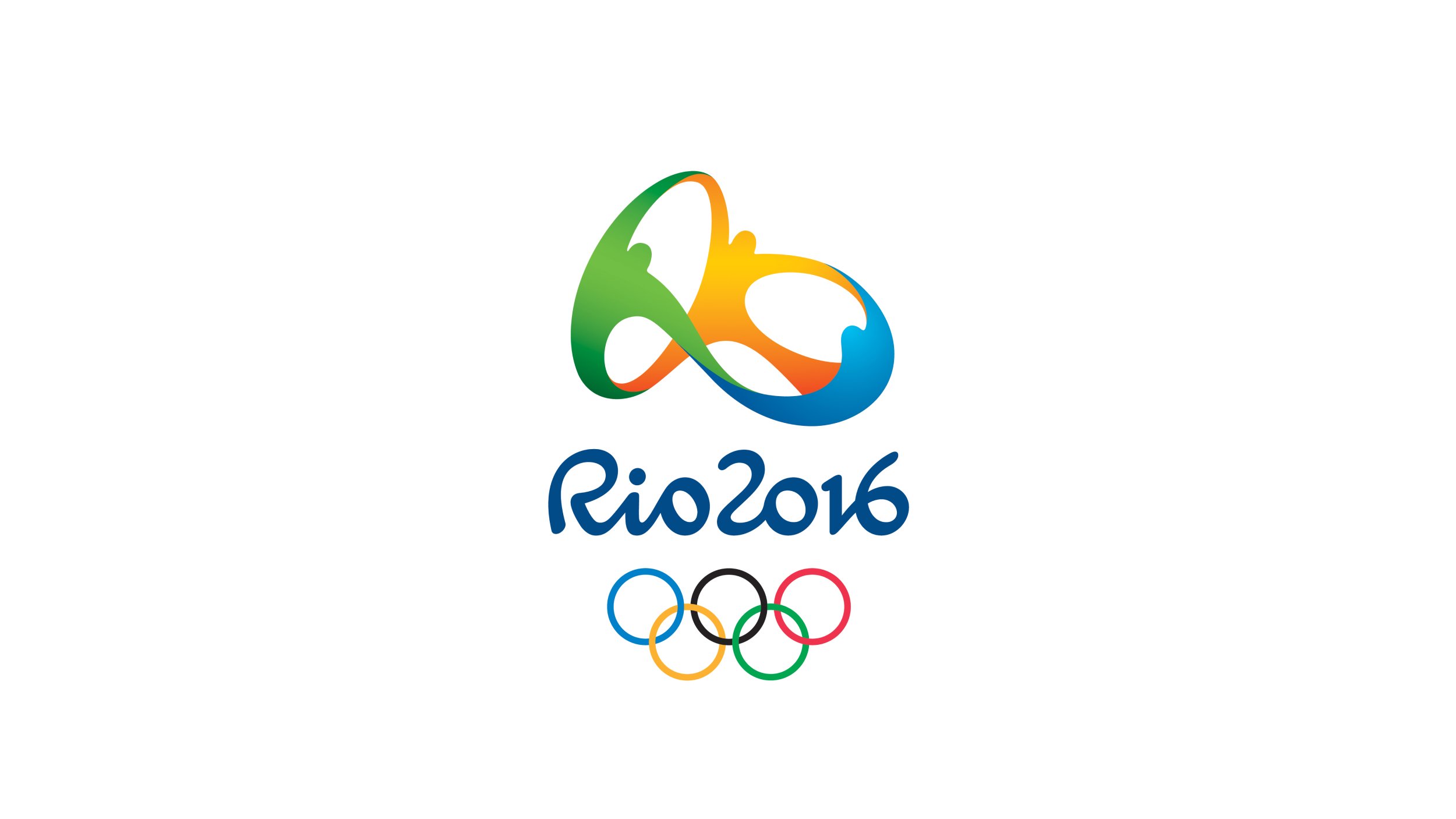
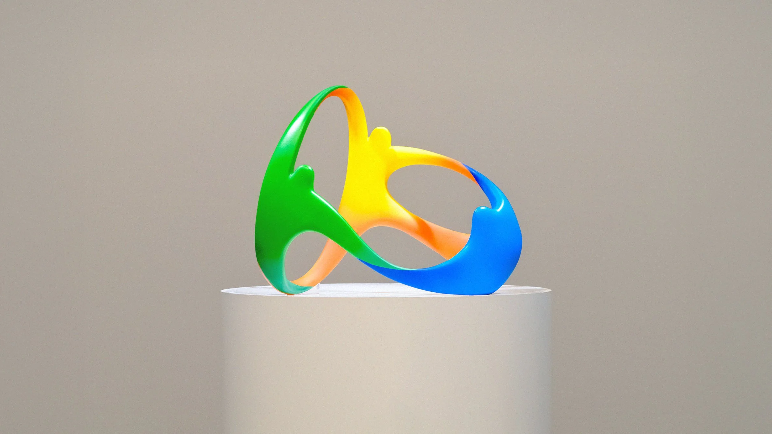
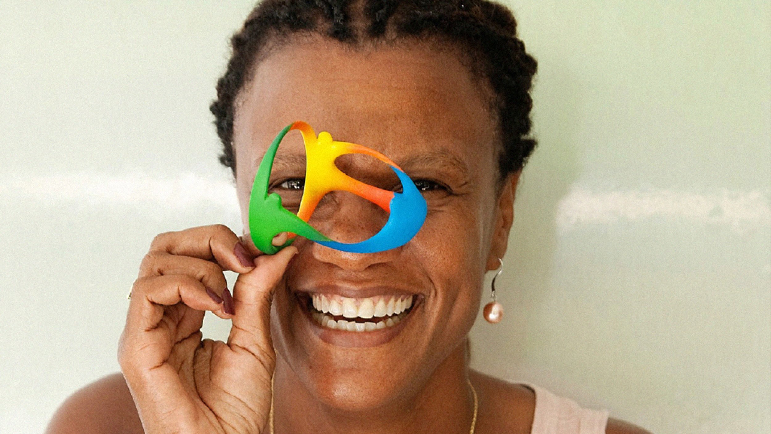
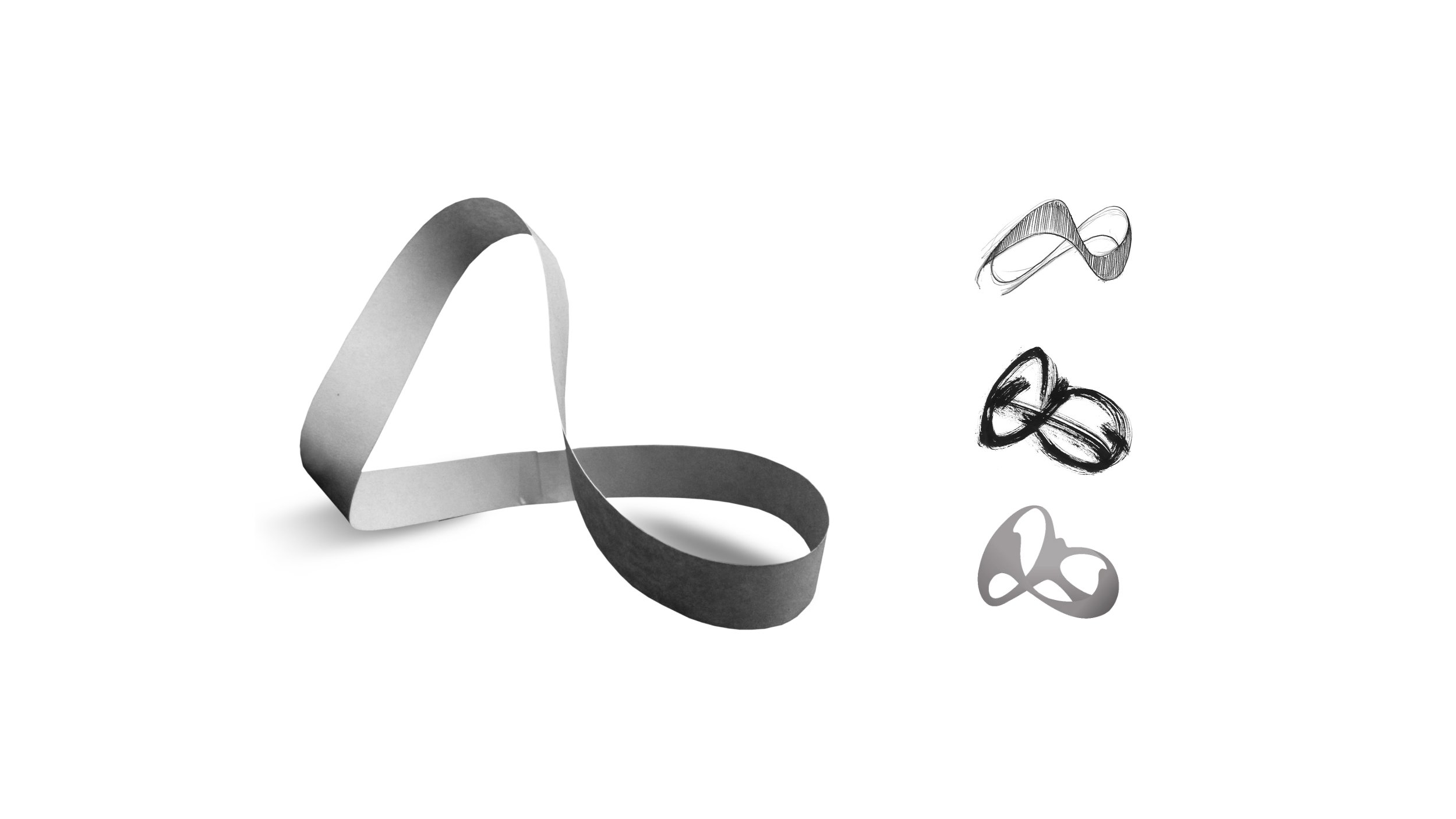
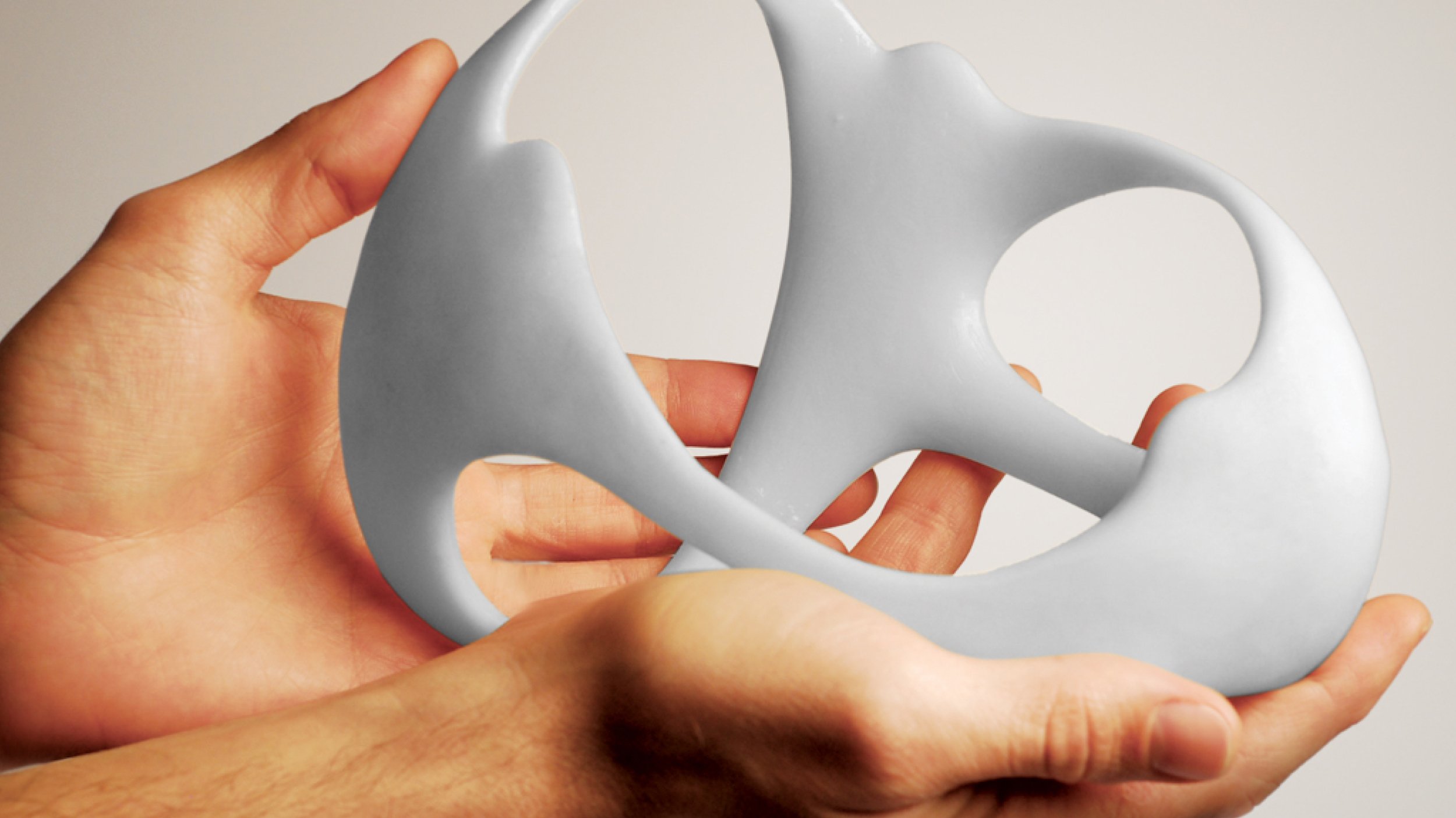
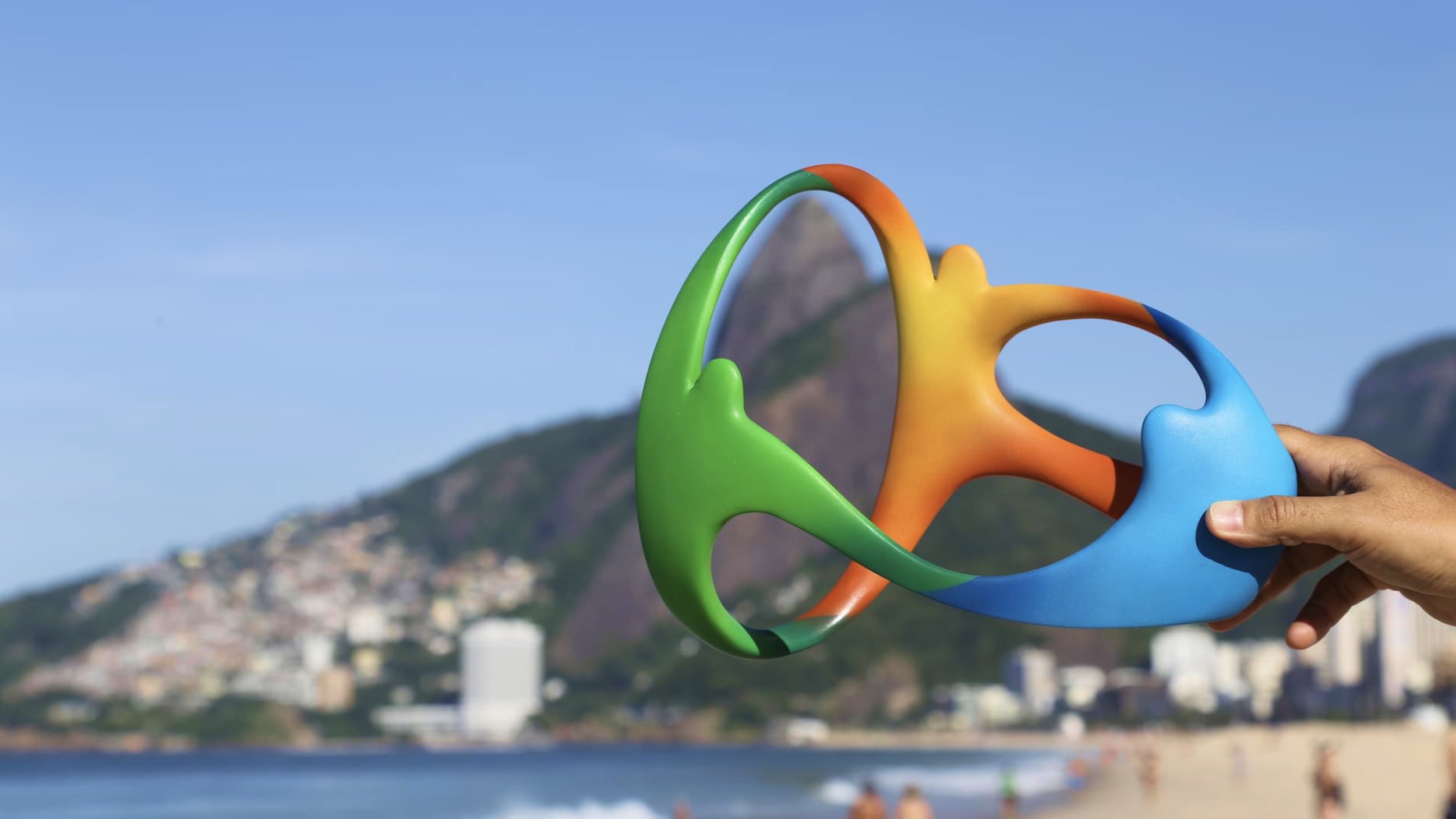
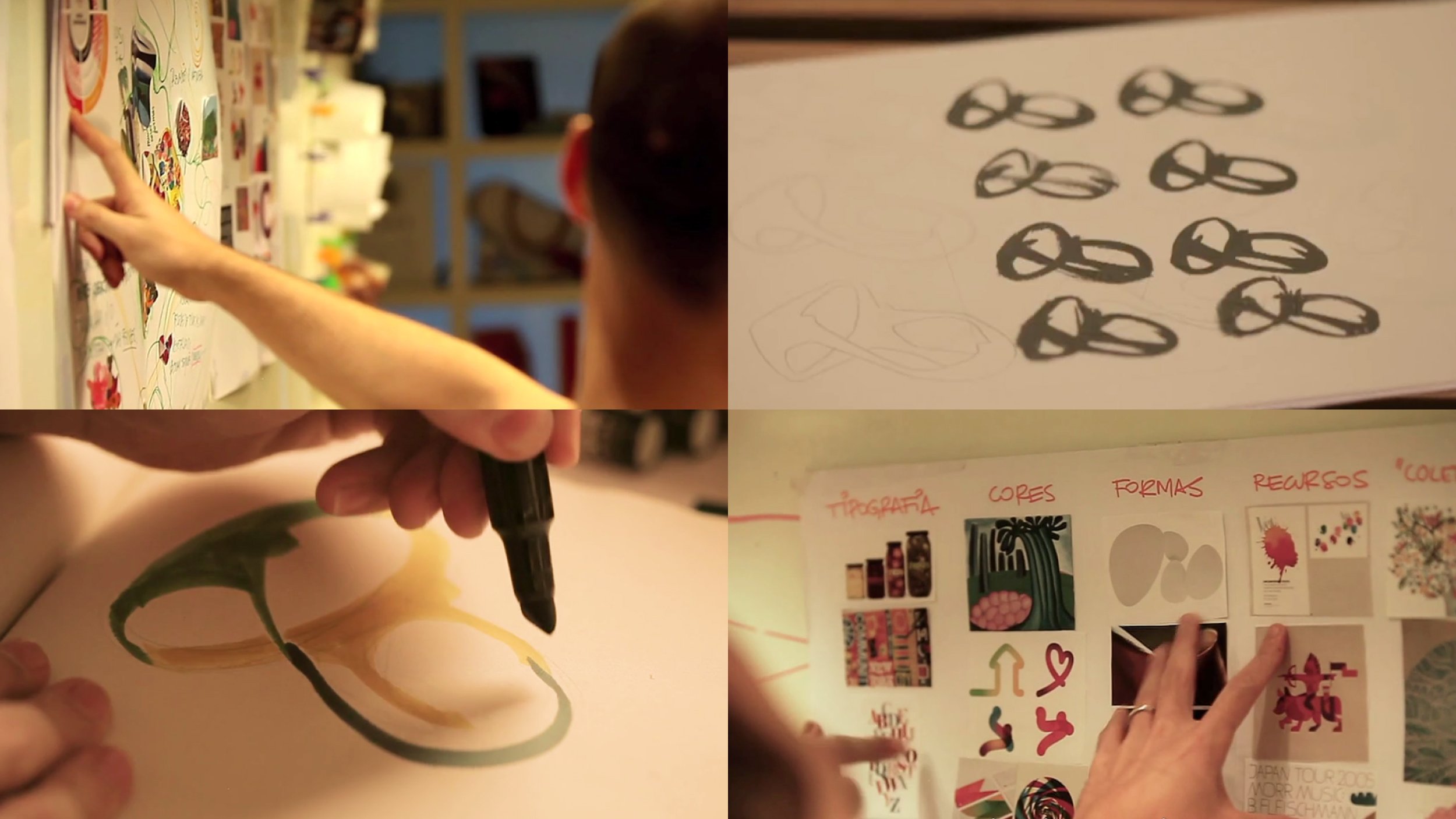
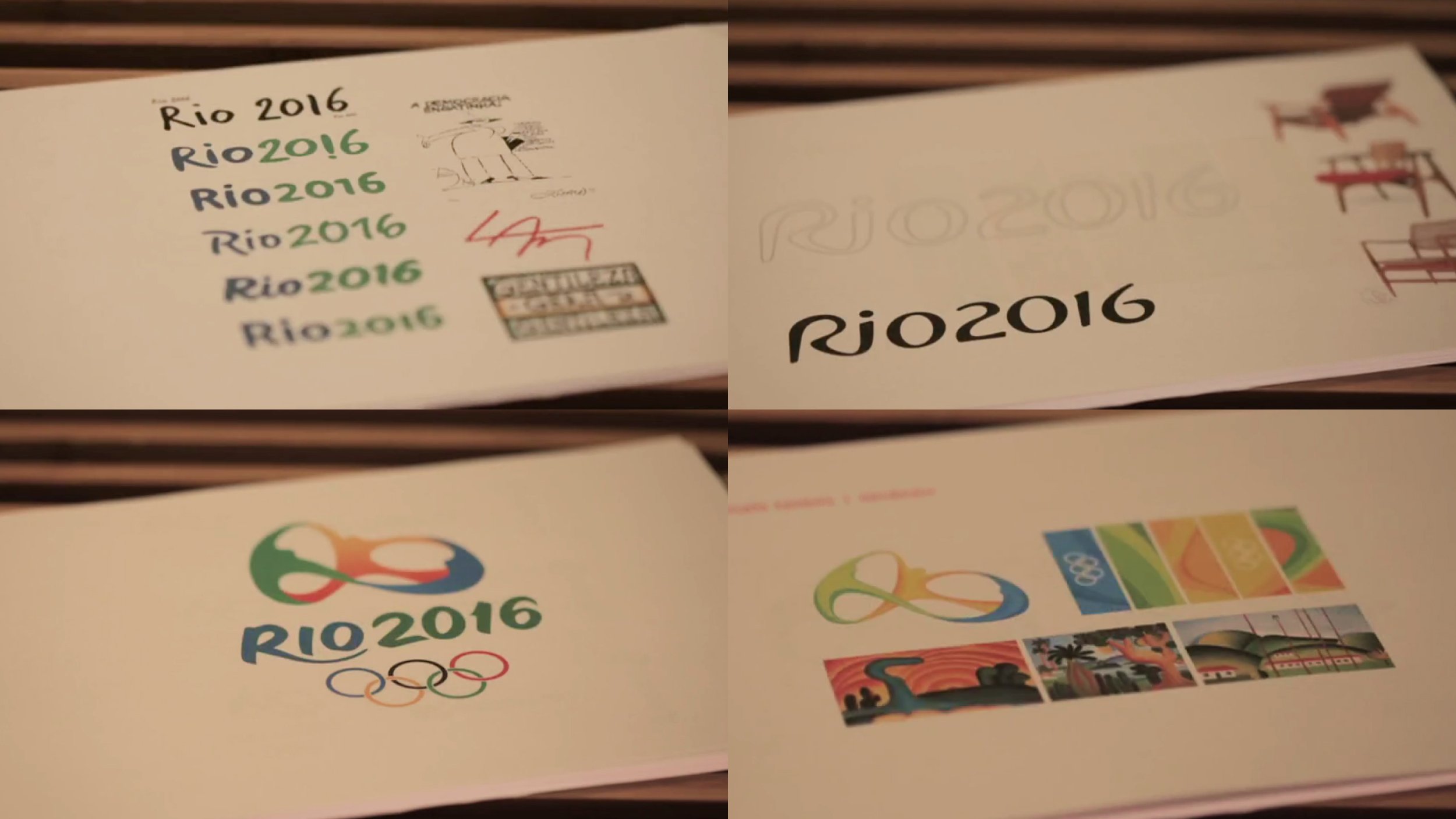
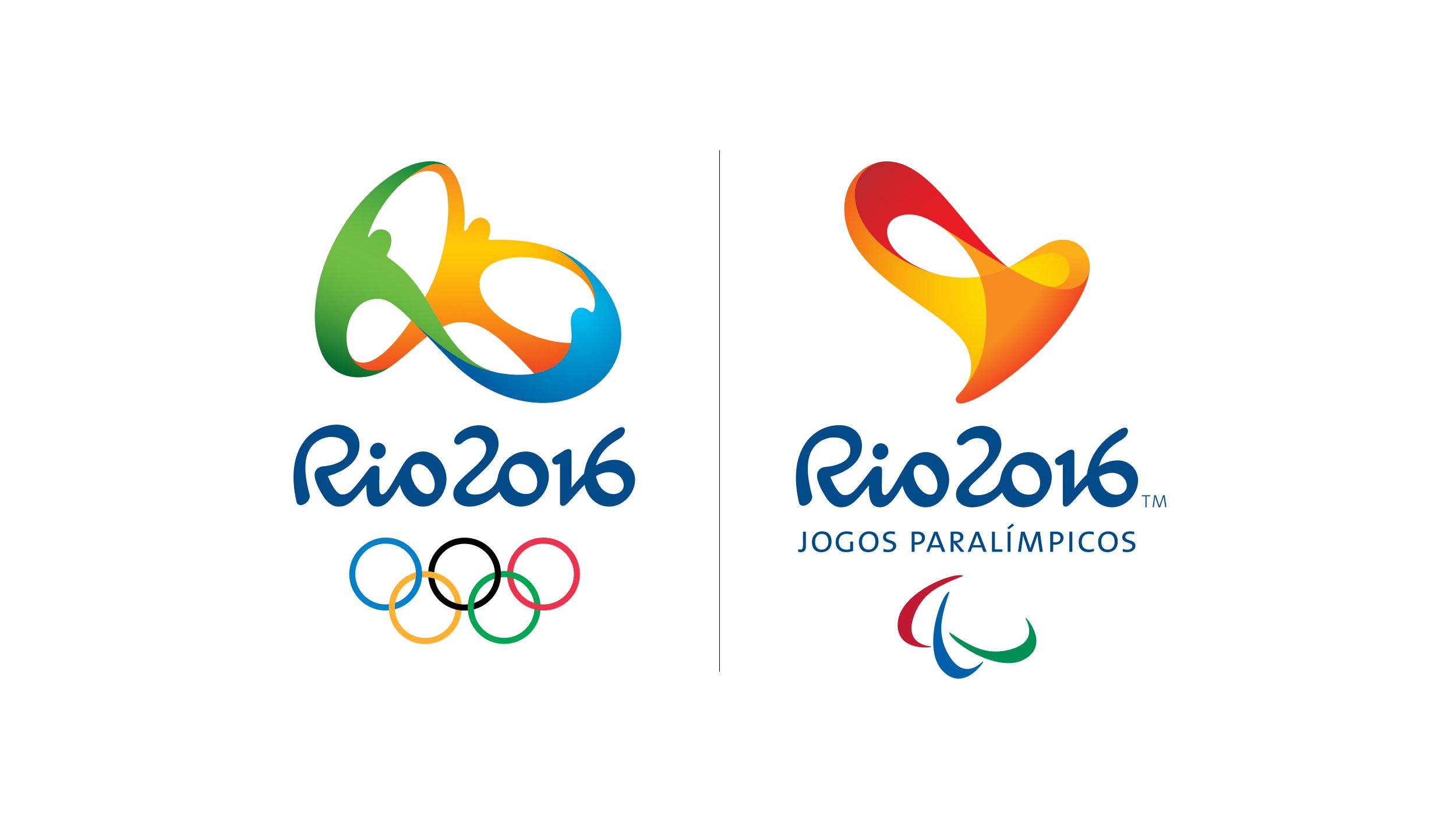
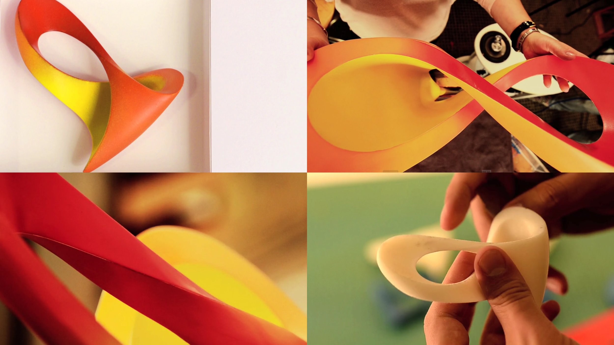
The challenge was huge: to express through a single symbol the encounter of Rio's joyful soul with the Olympic Values. A dynamic brand that had to express unity, inspire achievement and optimism. One that would impact millions around the world. It should be universal, innovative and still relevant in 2016, although created 7 years before. To achieve this, a group of strategists, designers, typographers and copywriters collectively shared and built upon the best references and ideas in a collaborative creative process. The result is a truly human brand, one that conveys a mix of ethnicities and cultures. A form that reveals the Sugarloaf and reflects the passion of its citizens. A sculpture-brand that becomes an object to be experienced.
Rio2016, 2009-2010
Branding
Studio: Tátil Design (Brazil)
Creative Directors: Fred Gelli,
Roberta Gamboa, Fernanda Saboia
Design Directors: Rafa Abreu, Ricardo Bezerra
Designers: Amanda Pacheco, André Coelho, Anna Fonseca, Beto Biscesto, Bruna Carbonesi, Camila Dias, Carlos Silva, Carolina Peixoto, Cristiano Faluba, Daniel Souza, Diego Fonseca, Felipe Caldas, Fernanda Casas, Gustavo Ferreira, Jana Glatt, João Faraco, Leonardo Lopes, Luciana Brasil, Paloma Valls, Pedro Ursini, Renata Rodrigues, Robson Novaes, Rodrigo Bessa, Roger Pinho, Samara Araujo, Tasso Canedo
Typography: Fabio Lopez
Award: IF Design 2012, Wave Festival 2012 (grand prix), Brasil Design Award 2012 (grand prix), Idea Brasil 2012, Cannes Lions 2012 (shortlist), Brazilian Graphic Design Biennial 2013
